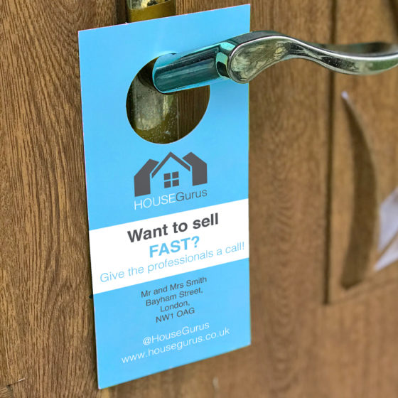
If you’re looking for a cost-effective way to promote your business or organisation, custom door hanger printing can be a great option. But in order for your door hanger to be effective, it needs to stand out and catch people’s attention. What size? What colour? Here are some tips on how to design a door hanger that will do just that.
Start with a clear and compelling message
In order to design an effective door hanger, you need to ensure that your message is communicated clearly and concisely. Your door hanger should have a headline and copy that are not only attention-grabbing but also relevant to your target audience. It’s important to remember that your target audience will be a specific group of people, so your message needs to resonate with them.
To create an attention-grabbing headline, you can use a bold font, bright colours, or a clever play on words. Your copy should support your headline and provide more information about your product or service. Keep your copy succinct, as your target audience is likely to be busy and may not have time to read a lot of information.
When deciding on your messaging, consider what sets your business apart from your competitors. What is the unique selling point of your product or service you’re advertising? Use this information to create a message that speaks directly to your target audience and sets you apart from the competition.
By taking the time to create a clear and concise message that resonates with your target audience, you can create door hangers that effectively communicates your message and encourages people to take action. Whether your goal is to increase foot traffic to your store or generate leads for your business, a well-designed door hanger can be an effective marketing tool.
Use high-quality images
Adding high-quality images to your door hanger is a great way to make it more visually appealing and eye-catching. When selecting images, it’s important to choose those that are relevant to your message, as this will help to reinforce the main idea that you are trying to communicate. For example, if you are promoting a new restaurant, you might include images of delicious-looking food to entice people to visit.
To make your images as impactful as possible, choose those that are bold, colourful, and high-quality. Using bold and vibrant colours can make your hotels door hanger more attention-grabbing, while high-quality images will help to ensure that your door hanger looks professional and well-designed. Be sure to choose images that are high-resolution, so they don’t appear blurry or pixelated when printed.
Choose a bold color scheme
When designing a door hanger style, choosing the right color scheme is an important consideration. Using bold colors can help your door hanger stand out and catch people’s attention, making it more likely that they will read and engage with your message. In fact, research has shown that the use of color can increase brand recognition by up to 80%.
When selecting colors for your bespoke door hangers, consider using contrasting colors to create a visually striking design. For example, pairing bright yellow with deep purple or vibrant orange with electric blue can make your door hanger more eye-catching and memorable. Alternatively, you could use complementary colors – those that are opposite each other on the color wheel – to create a balanced and harmonious color scheme.
Include a call to action
A clear call to action (CTA) is a crucial element of any effective door hanger design. The CTA is the part of the message that tells the viewer what to do next, whether it’s to visit your website, call your business, or visit your physical location. Without a clear CTA, the viewer may be unsure of what action to take, and the effectiveness of your marketing efforts may be compromised.
When creating a CTA for your door hanger, it’s important to keep it simple and clear. Use strong and action-oriented language, such as “Call Now,” “Visit Today,” or “Order Online.” Make sure the CTA is prominently displayed and easy to follow, using a font that is large and bold enough to be easily read.
Keep it simple
When it comes to designing an effective branded door hanger, simplicity is key. While you want your door hanger to stand out and catch people’s attention, you don’t want it to be overwhelming or cluttered. A cluttered design can be confusing and off-putting, and can actually detract from your message rather than enhance it.
To avoid clutter and keep your design simple, it’s important to focus on your main message and keep any additional information to a minimum. Start by identifying the key message or offer that you want to communicate, and then build your design around that central idea. Use a clear and attention-grabbing headline that clearly communicates your main message, and then use supporting text or images to reinforce that message. Simply add your design to one of our templates, whether it’s a standard shape or one of our die cut shapes, we’ve got you covered.
By following these tips, you can design a door hanger that will stand out and catch people’s attention. With the right message, design, and call to action, your door hanger can be an effective marketing tool for your uk business or organisation.
Order your door hangers with free delivery now!
